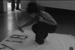
The creative and media class created a map from walking around Bermondsey. We had a class discussion on how to present the map in the college, to show what Bermondsey really looks like now and what it looked like before. We then had to decide where the map should be presented to the people that go to the college, why it's a good place for it to be, and what’s the purpose of making the map. We also had to think about what we could had done better if we had more time to think about it and used our creative skills to create a neater map to present it more readable. We did this by capturing areas of Bermondsey using a camera or sketching the place.
We as a group captured a lot of things around Bermondsey to share our moments to the people who come to the college. We want to create this map to show the experience on what we had done whilst going on this walk. This is why we took photographes to share the place on what we saw. We also collected a few things around the place and stuck them on the map, to show what was seen on the ground and what you expect to be on the groun around Bermondsey.
We created this map to show the people in the college what bermondsey looks like now. Although we also created this to show us students in the creative and media class what the place looked like before and how it has changed from the past until now. I think the place has changed a lot from what I've researched of the past, of Bermondsey, as you can see the difference on how the buildings looked then and how it looks now.
I think that the map should be at the front of where everyone swipes in because, then everyone can see it as they walk passed. I chose that place to present it to the college because its a huge area to put the map on. Although on the other hand, students who are rushing to get to their destinations would walk straight pass the map.
If we had another chance to re-create the map, i would consider the map to be more readable and have all the different squares of area to be the same colour background and road. The footpath of where we had walked through, cant really notice it because the roads are all in different colours. The photographes are stuck on different ways which i dont really mind because people can look at them in different angles. I dont really like the way the map has different objects and photographs stuck on the map because, it looks roughly done.
Overall i think that the map would had looked better if the group would had more time and thought towards the map when we first started creating it.


.jpg)
No comments:
Post a Comment