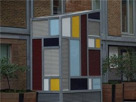
I chose an unusual object from Jacobs island to re-capture because it caught my eye as it was an interesting object to re-take. Before i re-invented this photo i produced three different ideas of what my photographs will turn out as.
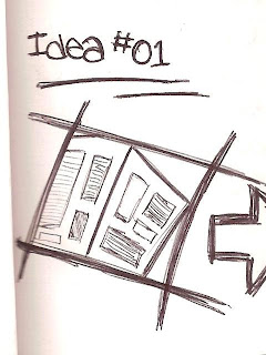
Idea #01 - Pointing from the corner of the object upwards. To get an effect of looking from the bottom of the object until the top. I like this method because you it can show the tallness of the object.

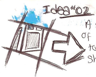
Idea #02 - A side view of the object to create a sharp view. I chose this technique because it will then show all the lines a sharp way when looking at the photo.

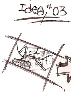
Idea #03 - Having another object in from of the main object. To create a double effect. Although trying to make the background burnt out so that you can only see the plant and the main object in the photo. I chose this technique because i thought i'd need to experiment with the light.

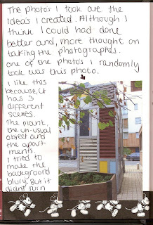 - out the way i wanted it to be.
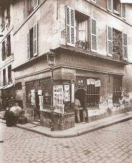
I then looked at some photographers that had made similar photographs i created. I first looked at my 1st idea. A photo created by EUGENE ATGET had created some sort of image just like mine. A sharp and straight object.
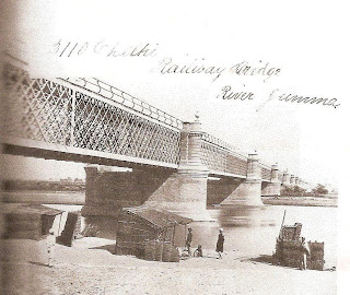
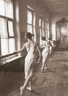
I then looked for someone for my 2nd idea. FRANCIS FRITH and CORNELL CAPA had both taken a photo that makes the object looked longer. So i therefore created a similar effect.
FRANCIS FRITH -
CORNELL CAPA -
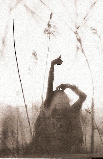
The 3rd idea was a hard choice. But overall i then found someone that had a similarity to my work. EIKOH HOSOE, i picked this photographer because he created a photograph showing 3 different parts of the photo. He used the flowers at the front, the main object which was the person and the background. Although he made the background completely burnt out.
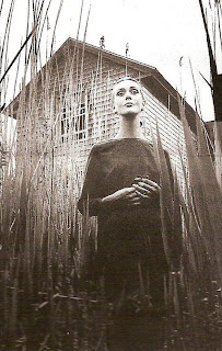
The last photo i picked that looked good also had a photographer that had similarity. JEANLOUP SIEFF. Although in my photo i took from it straight on and from Sieff's photo was taken from the bottle andgle upwards, to create a tall effect, and the background is completely bunt out, white.
Overall i think i improved the photo that was taken before because, you have a better effect, view and angle on all the ideas i produced. Althgough the original photo shows you the whole object.


.jpg)
No comments:
Post a Comment